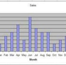
 Microsoft Excel is well-known for its spreadsheet capabilities; Excel 2007 is no different. The software contains numerous built-in formulas that can help users calculate everything from simple math to complex statistical and engineering operations. For those who are not as comfortable with enormous amounts of numerical data, Excel can also be used to create charts and graphs. One of the basic graphs that can be created in Microsoft Excel is a column graph.
Things You'll Need: Basic knowledge of Excel, Data for graph
1. Type "Month" in cell A1, and type the months January through December in cell A2 through A13. In cell B1, type "Applications." For each month, increase the "Applications" by 200. In cell B2, type "200," in cell B3 type "400" and so on. The last month in the "Month" column should be be in cell A13 and the last figure in the "Applications" column should be in cell B13.
2. Place the cursor on a cell in the "Month" and "Applications" data table. If the cursor is not on an item in the table, the chart will not know where to access the data. Press the "Insert" tab. Click on the down arrow under the "Column" option in the "Charts" panel.
3. Click on "Column" from the "Charts" section, and then select the first column chart option under "3-D Column."
4. Click on the border of the chart and drag it to the desired location. You can change the size of the chart by grabbing a border of the chart and dragging it.
